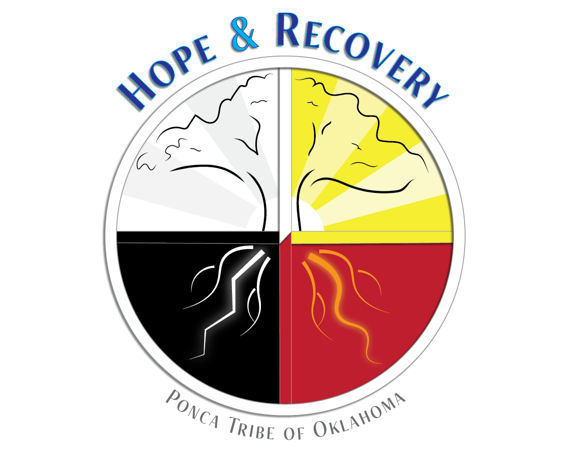
The White Eagle Behavioral Health Department had a problem. They needed to increase awareness of their service offerings among members of an already-skeptical community while also rebranding themselves as trustworthy in the eyes of people who'd previously found little to trust in. To meet these needs, I used traditional symbols to communicate a variety of messages in the logo alone.


First, I wanted to underscore an affiliation with the Tribe and with the Native people of the community in the logo. The heart of the logo includes symbols of the sky, land, and water which refers to the Tribe's current location--which is also a significant part of its history. There are also sacred aspects to the elements of air, land, and water, and the eagle feathers. Finally, the outer edge of the logo incorporates a medicine wheel as another symbol of healing and reflects the organization's commitment to helping patients achieve healing that addresses all aspects of what it means to be human on a spiritual, physical, mental, and emotional level.


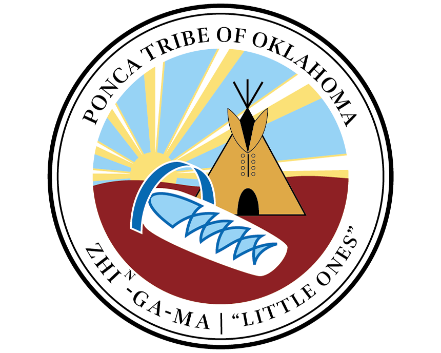
Horizontal orientation for the logo and corresponding logotype on both a white and a blue background, with and without the address for use as letterhead.

A stacked version of the logo when a square space is better, rather than rectangle (as above).
In addition to a new logo, I also created a new two-page brochure for my clients to use. This piece needed to serve multiple purposes: 1) to communicate with community members and prospective clients what services the Behavioral Health Department offers, and 2) to strengthen the department's image and credibility with potential partners and other governmental leaders in the wider area. I echoed the same symbols of land, air and water in the brochure that are present in the logo, and I used the tribal design that was already on the building to brand the piece with a recognizable pattern and Native look-and-feel. I also added a short biography for the staff members in order to help prospective clients have a better understanding of the quality and qualifications of the people who are serving them


This brochure became an important part of building the brand and brand value of the Department in particular and the Tribe in general when the staff needed to form new working relationships with other service providers in the Ponca City area.
After designing the logo and brochure, my client asked me to design ads for them that ran in a nearby movie theater, on guest television screens, and on an electronic outdoor billboard. The ads were designed to coordinate with the brochure and further build the branding and recognition of the department. Along with the ads, I designed souvenir magnets that became collector's items.