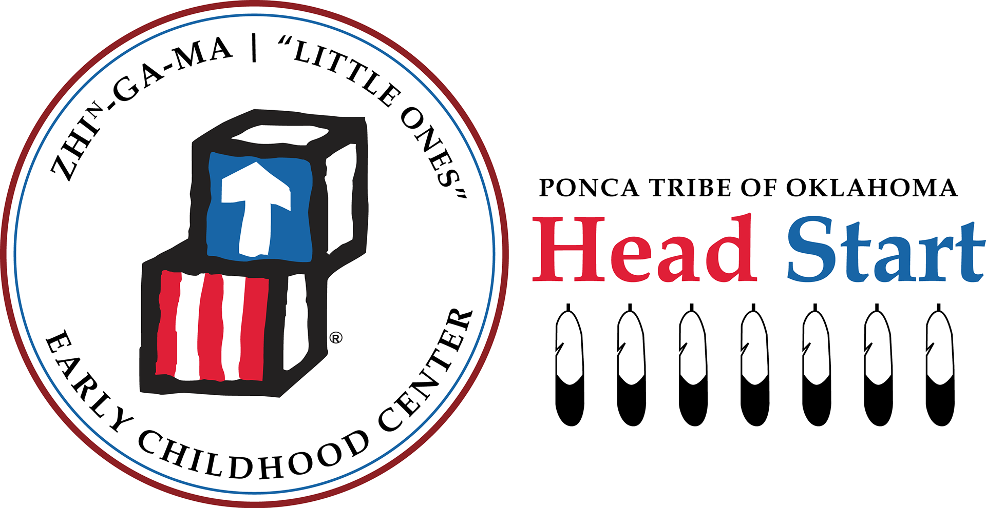
The Ponca Tribe's Child Development Center and HeadStart Programs needed departmental logos to use for advertising and branding purposes. I used traditionally Native icons to reinforce the branding as part of the community and the Tribe. I also wanted the logos to help communicate purpose and coordinate with the Tribal seal.
The Child Development center opens early in the morning, and the sun is included in the Tribe's seal, so I included a sunrise in the logo. I used one of the same tipi's from the original seal, and the same color from the pipe in the tribal seal to represent the land. I created the cradleboard artwork myself. The logo also includes the Ponca word for children, directly translated as "little ones."

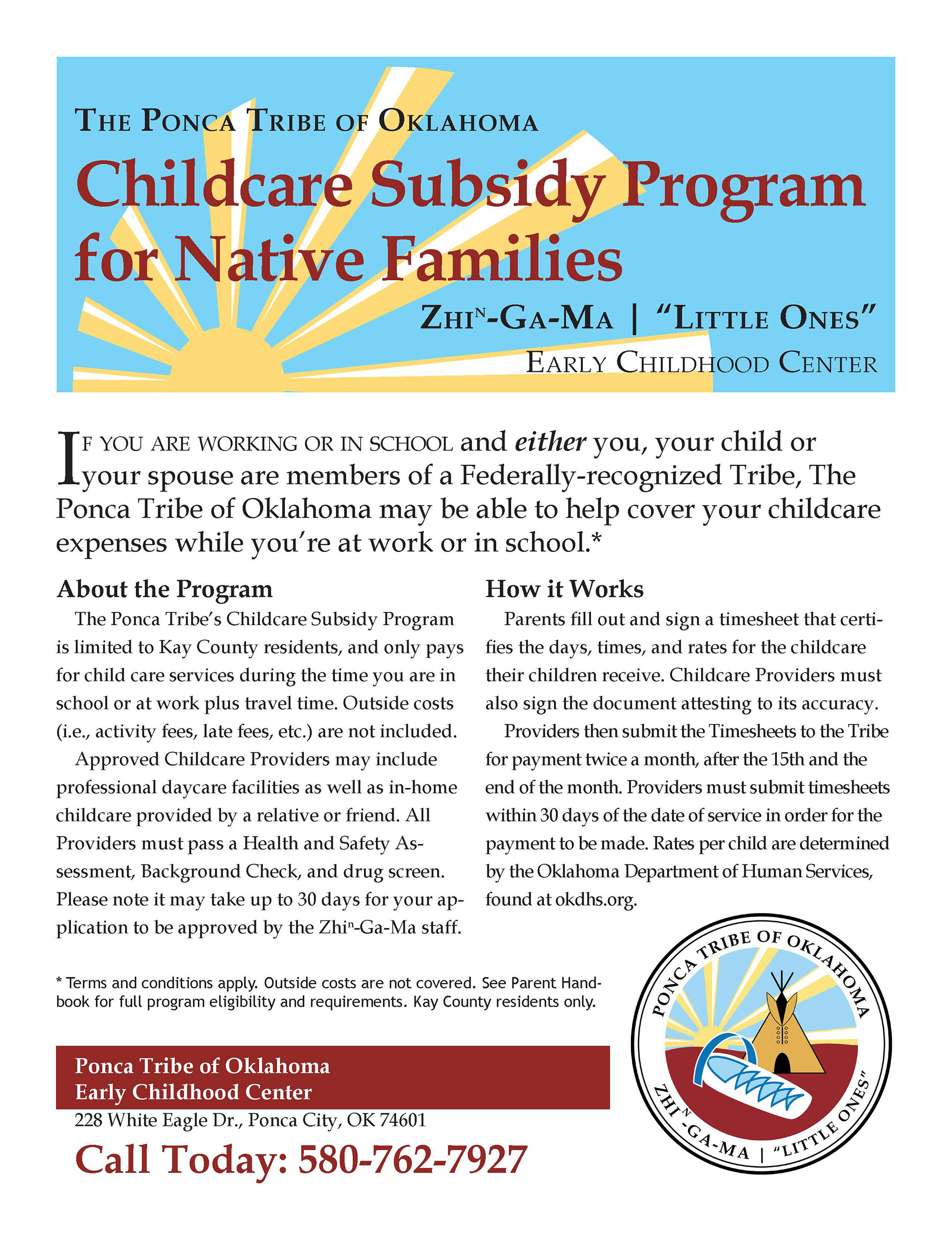
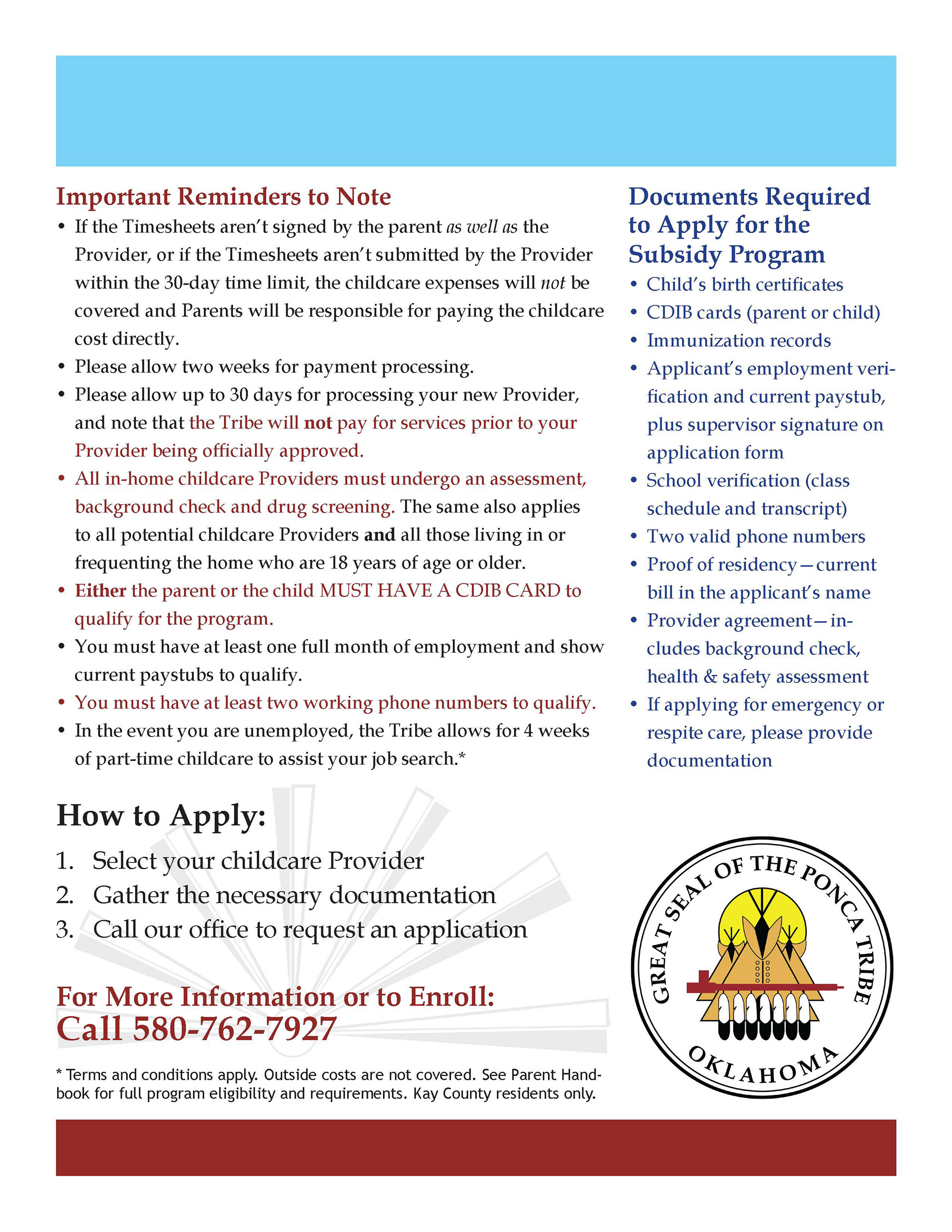
After designing the logo, I also created the brochure to go along with the new branding. I used Adobe Illustrator to create the original artwork and the watermark, and used Adobe InDesign to layout the brochure. I provided all the art direction, page layout, branding and copywriting services for the project.
Once the logo was designed, the client asked for a two-color version for use in getting departmental shirts ordered. This is how the art would look when printed or embroidered on the shirts. The client reported that employees were very happy with the way the shirts turned out.
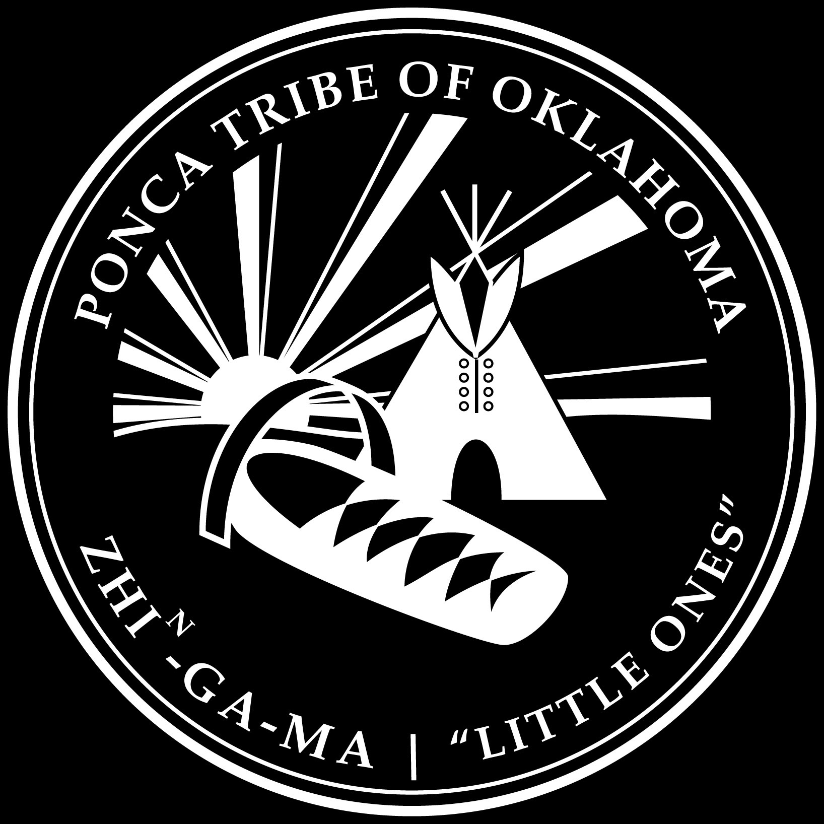
The tribe didn't have a vector image of the Tribal Seal for me to use, so I needed to recreate it from a photograph taken of printed letterhead. I used Adobe Illustrator to recreate this seal as a vector image that I used elsewhere.

The seal of the Ponca Tribe of Oklahoma.
Coordinating with the Child Development center, the Tribe's Head Start program also needed a logo for use in advertising, branding, and communications. I used the official Head Start logos and added in branding to coordinate with the Tribal seal and the child development center.