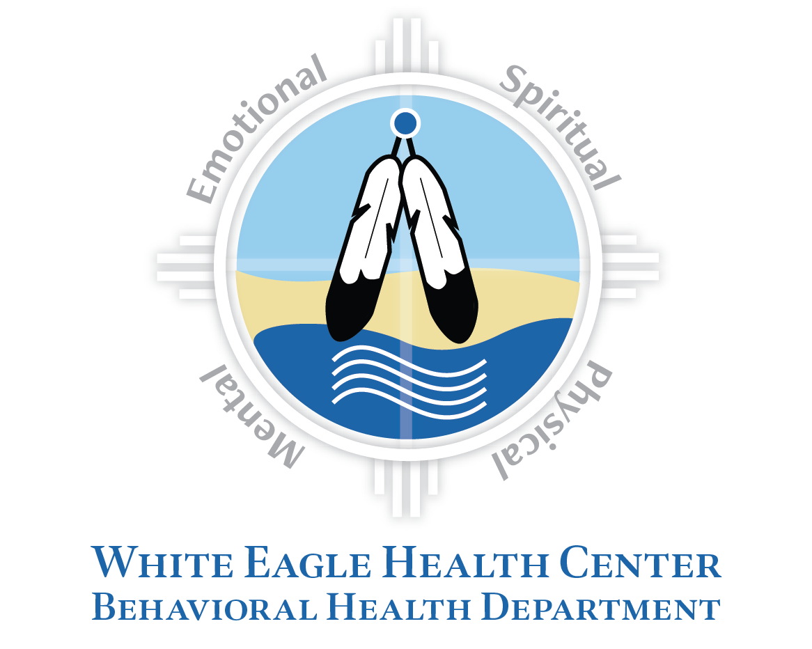
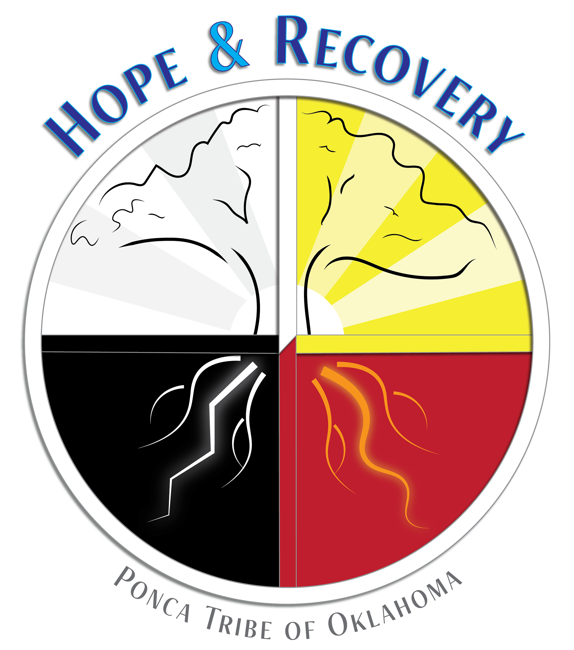
The Hope & Recovery Center needed to rebrand and re-introduce itself to the community after a change in leadership. I worked with staff to create a logo that communicated growth, change and healing in a Native way. I used the medicine wheel design and colors for the foundation of the logo, kept the circular formatting, included slightly different sunrise art, and added a tree to represent the patients and their personal growth through recovery. The roots of the tree are included, because they too are part of the tree, and a person likewise needs strong roots to overcome adversity. The roots also represent additional sacred elements that are a part of the medicine wheel interpretation.
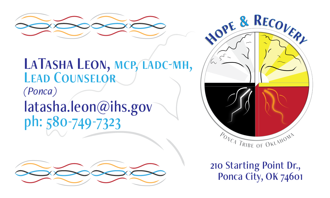
I also created matching business cards to go with the new logo and branding design. I used the lines of the branches of the tree to create the tribal ribbon work.
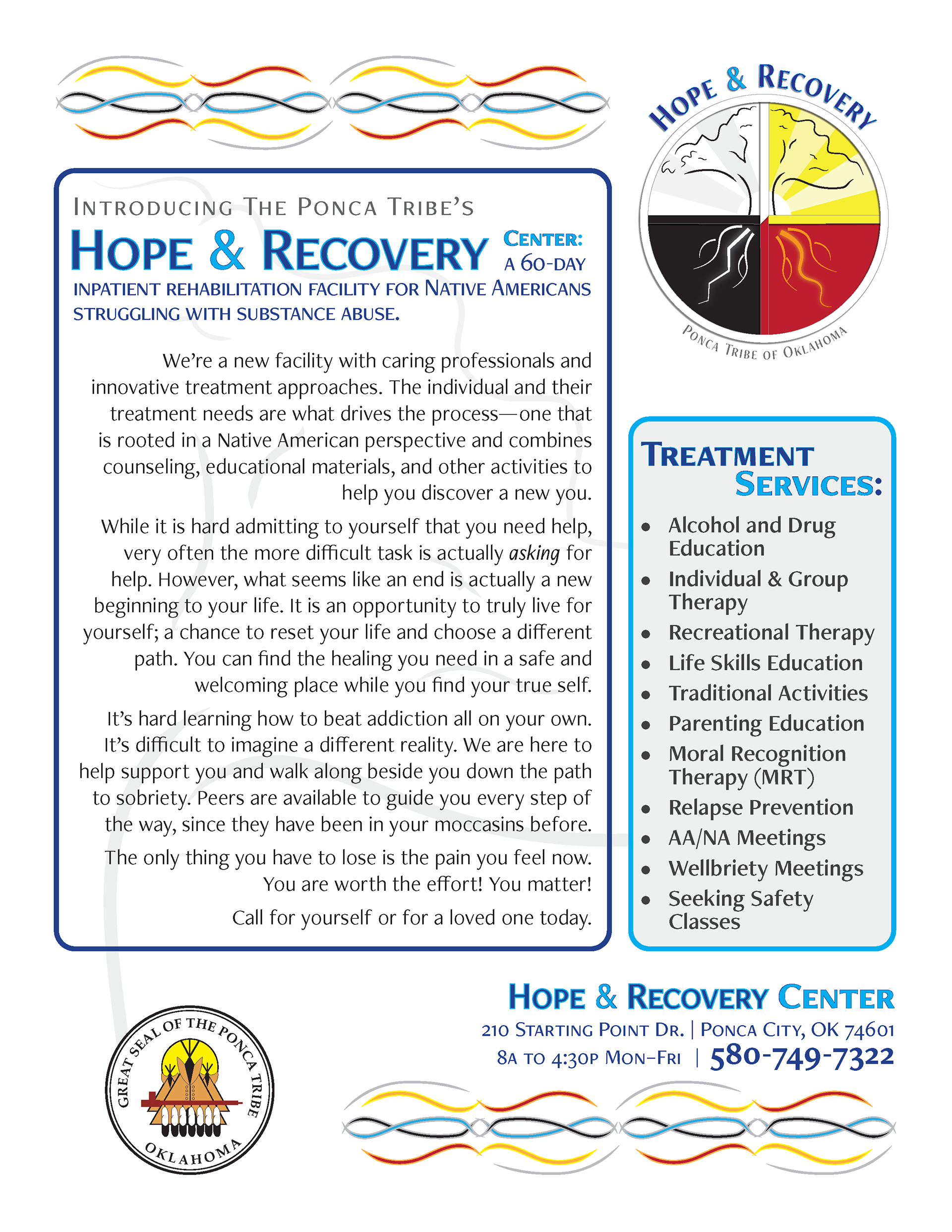
I created brochures to go along with the new branding and business cards. Per the client's request, I included a photo of a wall mural that is located at the center.